Sample report. A real dashboard, critiqued with the same process you'd get — nothing edited out. Request one for your dashboard →

Dataviz Critique Report

Operations performance review — Weekly dashboard

Prepared Jul 29, 2026 · Six-lens critique · Prepared by The Hooman Loop

Encoding Accuracy2/5
Data-Ink & Integrity3/5
Task–Encoding Fit3/5
Provenance & Trust3/5
Cognitive Load4/5
Annotation Clarity2/5

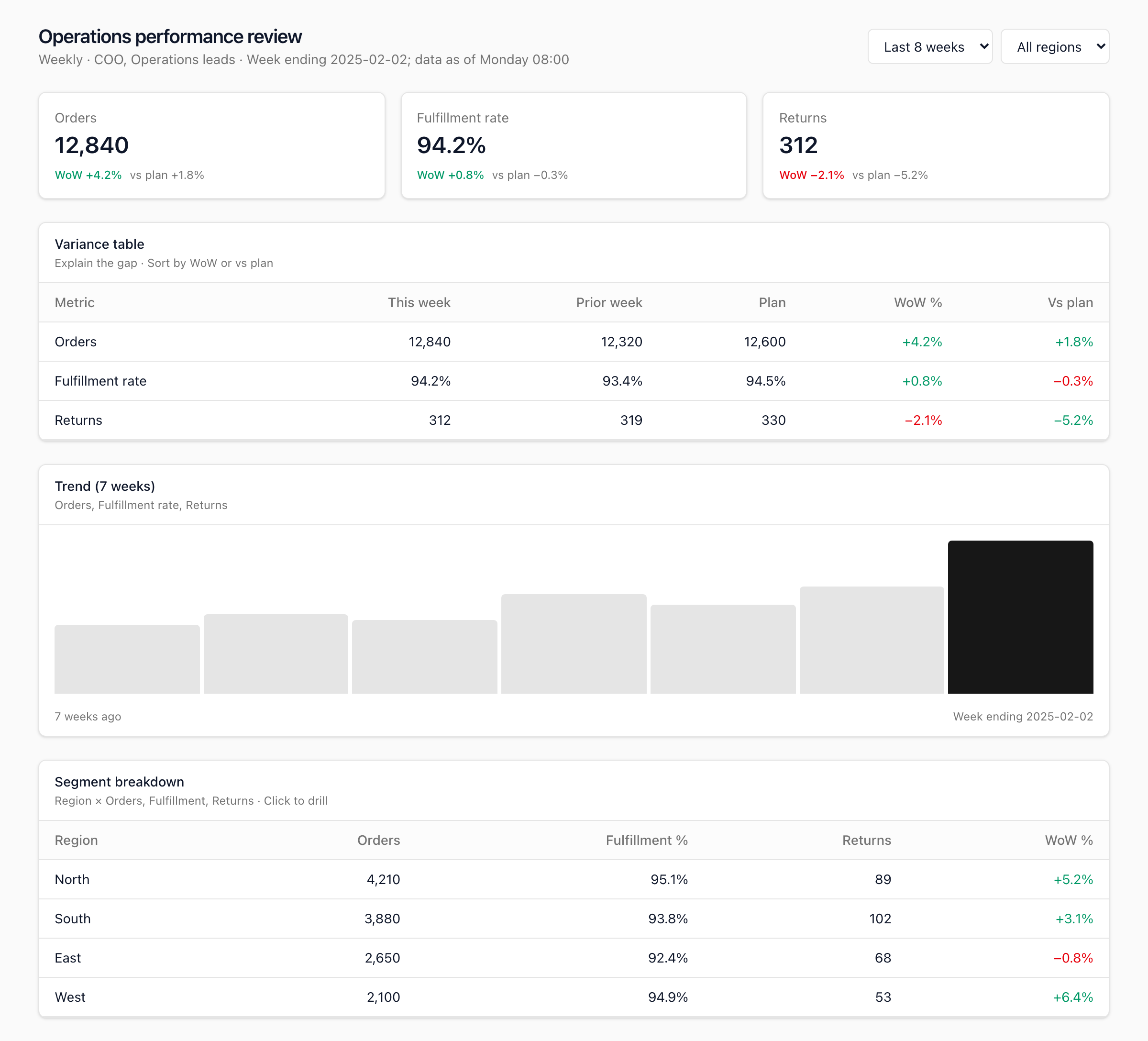
This weekly operations dashboard has an exemplary trust frame and a clean, overview-first layout, but its centerpiece visualization undercuts both. The Trend (7 weeks) block is labelled for three metrics (Orders, Fulfillment rate, Returns) yet renders a single unlabelled bar series with no value axis, so the most prominent chart on the page communicates almost nothing quantitatively. The fastest wins are rebuilding that trend as small multiples with a value axis and takeaway titles, and fixing the directional color for Returns, where a decrease is good but is currently flagged red.

Weekly operations performance review dashboard under critique

Weekly operations dashboard

Encoding Accuracy

Trend (7 weeks) chart

high

Impact
The subtitle names three metrics (Orders, Fulfillment rate, Returns) but the visual is a single row of seven bars with only the latest one emphasized. Three series cannot be read from one height-encoded bar set, so the most prominent chart on the page is undecodable — the reader cannot tell which metric is trending or by how much.

Recommendation
Split into three small multiples (one sparkline or bar row per metric) sharing a time axis, each with its own value scale and a zero baseline for the magnitude series. If the intent is to compare growth rates, use a single indexed line chart rebased to 100 at week one.

Technical note
Give each small multiple its own titled panel; keep week-over-week (WoW) deltas as direct labels on the latest point. Do not encode three metrics on one shared unlabelled height axis.

Returns delta color (KPI card and variance table)

medium

Impact
For Returns a decrease is good, but the −2.1% week-over-week change is colored red (as if bad) on both the key performance indicator card and the variance table, while the −5.2% versus plan is colored green in the table — so the same "lower is better" metric is encoded with opposite polarity in two places. Color, the fastest channel here, is actively misleading.

Recommendation
Define directionality per metric (Returns = lower-is-better) and apply one consistent rule everywhere: a decrease in Returns should read as favorable. Encode "good/bad" by semantic direction, not by raw sign.

Technical note
Centralize a per-metric polarity map and derive the delta color from it; do not color by numeric sign alone.

Data-Ink & Integrity

Trend (7 weeks) bars — data-ink

medium

Impact
Because the bars have no scale or labels, their heights encode no verifiable quantity — rounded tops and a single arbitrary color emphasis make this chartjunk masquerading as a chart. It occupies the largest visual block on the page while carrying the least information.

Recommendation
Replace with a real, scaled chart (see the small-multiples fix). If a compact spark is genuinely wanted, drop the rounded corners and add minimum/maximum value labels so the shape maps to numbers.

Technical note
Data-ink ratio: the current block is almost all non-data ink. Remove decoration; every mark should encode a value.

Task–Encoding Fit

Variance table — "Explain the gap · Sort by WoW or vs plan"

medium

Impact
The subtitle promises gap explanation and sorting, but there is no visible sort control or sorted-state indicator and no variance decomposition. The table shows values, not the driver of the gap, so it names a task it does not yet support.

Recommendation
Add a visible sort affordance and active-sort indicator on the WoW % and Vs plan columns, and surface the driver — for example a "biggest mover" callout or a contribution-to-variance column.

Technical note
Match the encoding to the stated task (Munzner why/what/how): the task is "explain", so provide a comparison and a decomposition, not just a lookup table.

Provenance & Trust

Metric definitions and lineage

medium

Impact
The freshness stamp is strong, but no metric is defined: there is no statement of how Fulfillment rate is computed, what counts as an Order or a Return, or where the numbers come from. A Chief Operating Officer (COO) cannot defend a number in a meeting without its definition and source.

Recommendation
Add a definitions affordance — a notes row or a hover per metric — giving the formula (numerator/denominator), the source system, the owner, and the refresh cadence.

Technical note
Provenance layer (Ben Fry pipeline / metric provenance): attach definition, lineage, and freshness metadata to each metric, not just the page header.

"Vs plan" definition

low

Impact
The "Vs plan" column appears without stating the plan vintage (annual plan or a re-forecast) or whether the comparison is weekly or cumulative, so two readers can interpret the same variance differently.

Recommendation
Footnote the plan definition and its as-of date, and state whether the comparison is the weekly plan or cumulative to date.

Technical note
Trust depends on the reader knowing exactly what the baseline is.

Cognitive Load

Segment breakdown — ambiguous WoW % column

low

Impact
The region table mixes counts (Orders, Returns) with a rate (Fulfillment %) and a single WoW % column, leaving it unclear which measure the week-over-week change refers to. The reader has to guess it means Orders.

Recommendation
Label the delta column with its measure (for example "Orders WoW %") or provide a per-measure delta; keep the strong overview-first ordering as is.

Technical note
One message per column: either scope the delta explicitly or split it per measure.

Annotation Clarity

Trend (7 weeks) chart — axis, labels, legend

high

Impact
The chart has no value axis, no units, no data labels, and no legend. The single dark final bar signals emphasis but carries no readable value, and the only ticks are "7 weeks ago" and "Week ending 2025-02-02". A reader takes away a vague shape, not a number.

Recommendation
Add a value axis or direct data labels on the latest and peak points, a legend mapping color to series, and a takeaway title (for example, "Orders +4.2% week over week — a 7-week high") instead of the generic "Trend (7 weeks)".

Technical note
Titles-as-takeaways (Knaflic): the panel heading should state the conclusion; keep the metric name as a subtitle.

Table headers — missing units and dates

low

Impact
Headers omit units and periods: "Returns" is a count while "Fulfillment rate" is a percentage, and "This week" / "Prior week" never state the actual week-ending dates, so the numbers are slightly harder to interpret and cite.

Recommendation
Add units to headers (for example "Returns (count)", "Fulfillment rate (%)") and the concrete week-ending dates under "This week" and "Prior week".

Technical note
Units and periods belong in the header, not inferred from the cell values.

How this report is put together

Each data visualization is evaluated against six established dataviz principles: Encoding Accuracy, Data-Ink & Integrity, Task–Encoding Fit, Provenance & Trust, Cognitive Load, and Annotation Clarity — drawn from Tufte, Cleveland & McGill, Munzner, Ben Fry, Shneiderman, Few, and Knaflic.

Every principle receives an independent score from 1 to 5. Scores are qualitative judgments, not an automated calculation: each reflects how well the artifact meets that principle, weighted by impact and how frequently the issue occurs. Individual findings are labelled by severity, and the count and severity of findings under a principle inform its score.

Score scale (1–5)

ScoreMeaning
1Critical failures; misleading or unreadable
2Significant issues; workarounds required to interpret
3Adequate; meets basics but clear room to improve
4Strong; minor gaps only
5Exemplary; reference-quality for this lens

Severity levels

SeverityWhen it applies
HighMisleads the reader, breaks integrity, or blocks the core task
MediumAdds friction or confusion; weaker-than-ideal encoding for many readers
LowPolish, minor inconsistency, or edge-case improvement

How we reached each score

Encoding Accuracy

2/5

Significant issues; workarounds required to interpret

Two issues drive this below adequate: the trend chart collapses three named metrics into one ambiguous height-encoded bar series (high), and directional color for Returns is applied inconsistently and with the wrong polarity (medium).

Data-Ink & Integrity

3/5

Adequate; meets basics but clear room to improve

Tables are high-data-ink and honest (prior week, plan, and deltas side by side), but the trend bars are effectively non-data decoration, which pulls the score to the middle.

Task–Encoding Fit

3/5

Adequate; meets basics but clear room to improve

Structure serves the weekly-review task and the segment table supports drill, but the variance table promises to "explain the gap" and sort with no visible sort state or driver decomposition, and the hero chart does not support the comparison it names.

Provenance & Trust

3/5

Adequate; meets basics but clear room to improve

A strong, explicit freshness and period stamp plus prior-week and plan columns give real trust, but it stops short of metric definitions, plan vintage, and lineage.

Cognitive Load

4/5

Strong; minor gaps only

Overview-first ordering, a consistent card rhythm, and restrained density keep the page easy to scan; filters are present and unobtrusive.

Annotation Clarity

2/5

Significant issues; workarounds required to interpret

The key performance indicator cards annotate deltas well, but the trend chart has no axis, units, data labels, or legend, and every section title is generic rather than a takeaway.

Acronyms used in this report

  • COO — Chief Operating Officer
  • KPI — Key Performance Indicator
  • WoW — Week over Week

Want this for your dashboard?

Send one dashboard or chart and we'll run the same six-principle critique — scorecard, prioritized findings, and specific fixes — and send you a link like this one. Free.

Request your free critique