See exactly where your dashboard loses the reader.
Send one dashboard or chart. Get back a scored, prioritized dataviz critique — the same report we run for clients, across six principles, with every finding ranked by how much it costs the decision. Free, and prepared by The Hooman Loop.
Most feedback on a dashboard is either a vague "make it cleaner" or a styling nitpick that misses the point. A dataviz critique is the thing in between: a practitioner reading your actual chart, naming what misleads or buries the signal, why it matters to the person making the decision, and what to change — in priority order.
This is not a redesign and not a tooling opinion. It's a structured read of whether your visualization actually supports the decision it's meant to drive.
What we look at
Six principles, every time
Every critique scores the same six principles — drawn from Tufte, Cleveland & McGill, Munzner, Ben Fry, Shneiderman, Few, and Knaflic — so the read is consistent and comparable rather than a matter of taste.
Encoding Accuracy
Do the marks fit the data — the right channel for the task, a perceptual order that matches the values, zero baselines for magnitude?
Data-Ink & Integrity
Is every mark carrying information — no chartjunk, no truncated axes, no distorted scales, one message per chart?
Task–Encoding Fit
Does the encoding serve the actual decision — the why, the what, and the how of the reader's task?
Provenance & Trust
Can the reader trust the numbers — definitions, lineage, freshness, and caveats present and correct?
Cognitive Load
Overview-first, sensible density and grouping, progressive disclosure — or everything competing at once?
Annotation Clarity
Do labels, units, legends, and titles-as-takeaways make the point, or leave the reader to decode a shape?
How it's scored
Every principle gets a score from 1 to 5
| Score | What it means |
|---|---|
| 1 | Critical failures; misleading or unreadable |
| 2 | Significant issues; workarounds required to interpret |
| 3 | Adequate; meets basics but clear room to improve |
| 4 | Strong; minor gaps only |
| 5 | Exemplary; reference-quality for this principle |
And every individual finding is labelled by severity, so you know what to fix first:
- HighMisleads the reader, breaks integrity, or blocks the core decision
- MediumAdds friction or confusion; weaker-than-ideal encoding for many readers
- LowPolish, minor inconsistency, or edge-case improvement
What you get
A real report, not a reply
- An executive summary — the headline read on the dashboard in a few sentences.
- A scorecard — all six principles scored 1 to 5, with the reasoning behind each score.
- Prioritized findings — each with the element, the principle, a severity, the impact on the decision, a concrete recommendation, and a technical note for whoever implements it.
- What's working — two or three genuine strengths, because a critique that only lists problems isn't honest.
- An appendix — methodology, per-score reasoning, and a plain-language glossary for any acronym used.
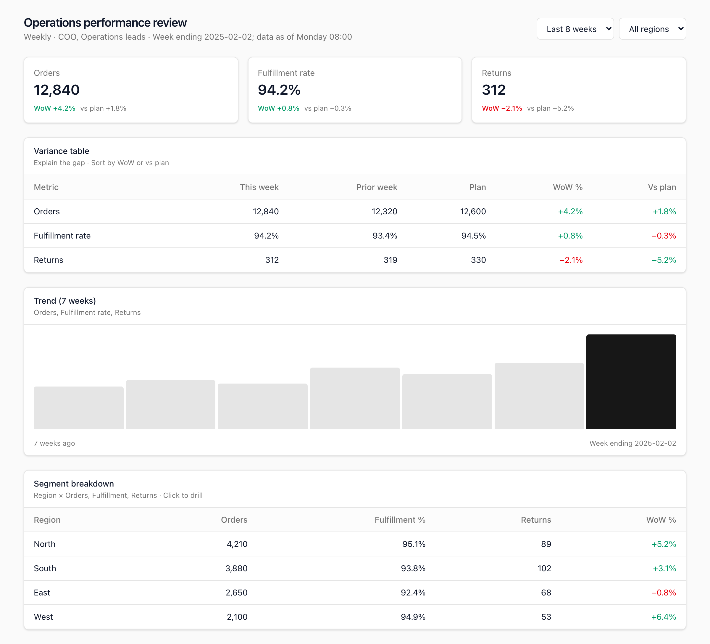
See a full example → We ran this exact process on a weekly operations dashboard. Read the complete Dataviz Critique Report — scorecard, all nine findings, and the appendix.
How it works
Three steps
-
Send one dashboard
Upload a screenshot of the dashboard or chart that matters most — the one a decision hangs on. One artifact, so the read stays deep instead of shallow.
-
We critique it
We run the six-principle critique against what a real reader actually sees, weighing each finding by its impact on the decision the view is meant to support.
-
You get a shareable report
A private link to the full report — scorecard, prioritized findings, and specific fixes — that you can forward to your team. Typical turnaround is a few business days.
Is this for you?
Who it's for — and who it isn't
A good fit
- You have a dashboard or chart a real decision depends on — and you suspect it's not landing.
- You're an analytics lead, PM, founder, or operator who can act on the findings.
- You want a specific, prioritized read, not reassurance.
- You can point to one view that matters most right now.
Not a fit
- You want a full BI rebuild or a new data model — that's a different engagement.
- You're looking for data engineering or pipeline work specifically.
- The numbers themselves are wrong at the source — a critique reviews the visualization, not the ETL.
- The dashboard is too sensitive to share — run the critique yourself with the self-serve kit instead.
- You want a rubber stamp rather than an honest critique.
Request your critique
Get a free dataviz critique of one dashboard
Upload the dashboard and tell us the decision it's supposed to support. If it's a fit, we'll critique it and send you the report. No cost, no obligation.
Dashboard too sensitive to send? Run the same critique yourself — fork dataviz-kit and use /dataviz-crit in Cursor. Nothing leaves your machine.
We read every request personally and reply either way. Your dashboard and answer stay between us.
From the talk
Saw this at Dataviz Philly? The Dataviz Heroes slides are here: view the deck.