See exactly where your interface loses people.
Send one page. Get back a scored, prioritized UX critique — the same report we run for clients, across seven principles, with every finding ranked by how much it costs you. Free, and prepared by The Hooman Loop.

Most feedback on a website is either a vague "it feels off" or a 40-point automated audit nobody reads. A UX critique is the thing in between: a designer looking at your actual page, naming what breaks, why it matters to the person using it, and what to do about it — in priority order.
This is not a redesign, not a brand opinion, and not a Lighthouse score. It's a structured read of how your page works for the people you're trying to convert.
What we look at
Seven principles, every time
Every critique scores the same seven principles, so the read is consistent and comparable rather than a matter of taste.
Usability
Can people complete the task they came to do — without dead ends, confusion, or guesswork?
Visual Hierarchy
Does the layout guide the eye to what matters, or does everything compete for attention at once?
Consistency
Do labels, patterns, and calls to action behave the same way everywhere, or drift page to page?
Accessibility
Can everyone use it — sufficient contrast, real landmarks, keyboard paths, WCAG basics met?
Feedback & Affordances
Does the interface tell people what's clickable, what happened, and what to do next?
Cognitive Load
Is the page asking people to hold more in their head than the task actually requires?
Mobile Responsiveness
Does it hold up on a real phone — reachable actions, readable text, no broken layout?

How it's scored
Every principle gets a score from 1 to 5
| Score | What it means |
|---|---|
| 1 | Critical failures; unusable or inaccessible |
| 2 | Significant issues; workarounds required |
| 3 | Adequate; meets basics but clear room to improve |
| 4 | Strong; minor gaps only |
| 5 | Exemplary; reference-quality for this principle |
And every individual finding is labelled by severity, so you know what to fix first:
- HighBlocks tasks, causes errors, excludes users, or damages trust
- MediumAdds friction, confusion, or inconsistency for many users
- LowPolish, minor inconsistency, or edge-case improvement
What you get
A real report, not a reply
- An executive summary — the headline read on the page in a few sentences.
- A scorecard — all seven principles scored 1 to 5, with the reasoning behind each score.
- Prioritized findings — each with the element, the principle, a severity, the user impact, a concrete recommendation, and a technical note for whoever implements it.
- What's working — two or three genuine strengths, because a critique that only lists problems isn't honest.
- Desktop and mobile screenshots of the page as captured.
- An appendix — methodology, per-score reasoning, and a plain-language glossary for any acronym used.
See a full example → We ran this exact process on our own homepage. Read the complete UX Critique Report for thehoomanloop.com — scorecard, all eleven findings, and the appendix.
Request your critique
Send the page. We'll take it from there.
Email and URL are enough. Context helps us focus — it's optional.
The pattern across every site
What we keep finding
Aggregated across every critique we've run to date, one principle fails more than any other — by a wide margin.
- 36Pages critiqued to date
- 7Distinct sites reviewed
- 241Findings logged (55 high · 128 medium · 58 low)
- 2.28Average accessibility score — the lowest of all seven
Average score by principle (1–5), worst first:
What it looks like
We ran it on our own homepage
No cherry-picked client. Here is our own site, critiqued, with the real findings marked on the page. Every callout below is a line item in the full report.
 1
1
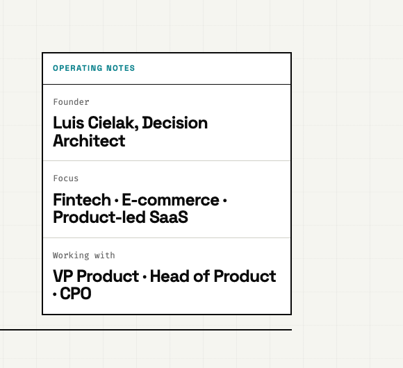
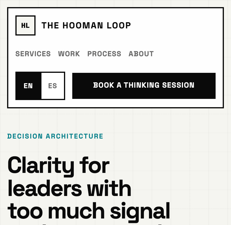
- 1Teal labels like this one (
#067F8A) on cream measure about 4.3:1 — below the WCAG AA 4.5:1 bar for normal text, so wayfinding labels are hard to read for low-vision users.
 2
2
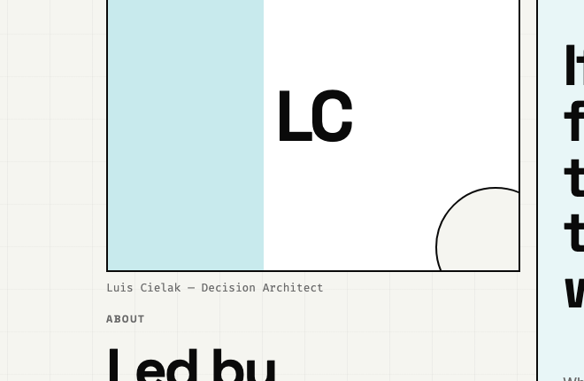
- 2An "LC" monogram sits where a founder portrait should — undercutting credibility at the exact moment a visitor decides whether to book.
 3
3
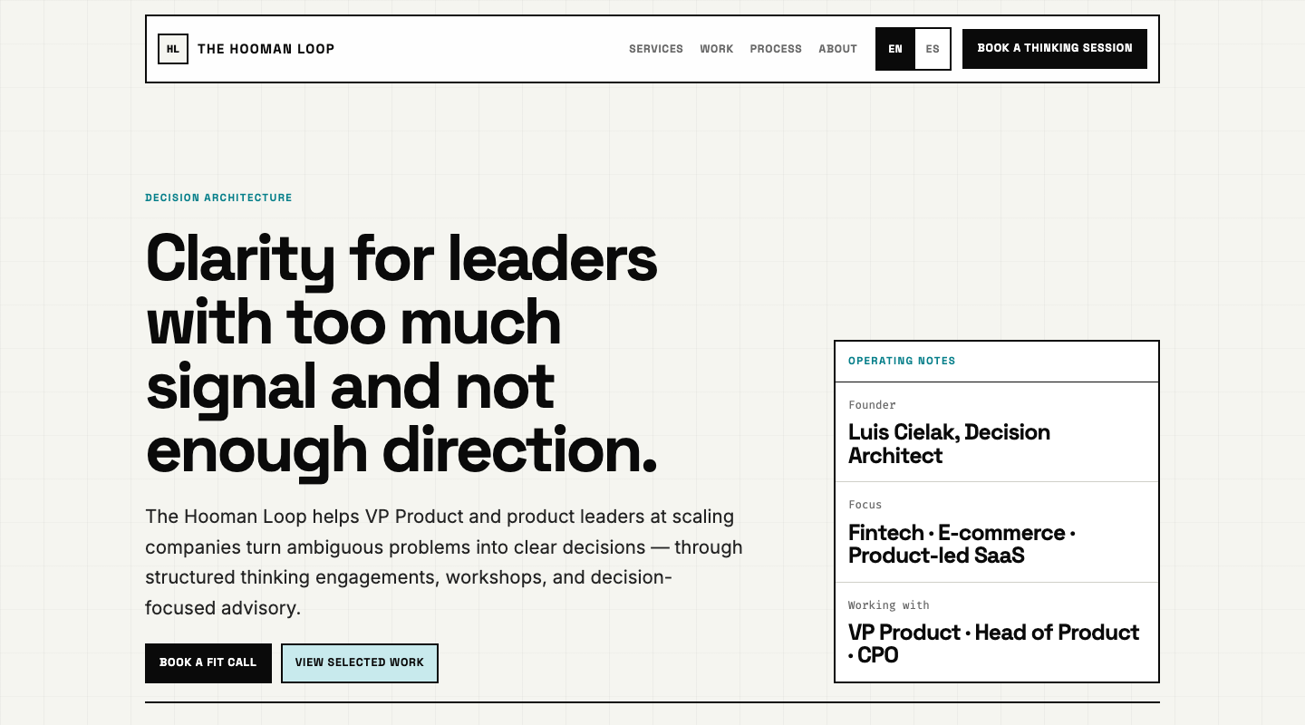
- 3The header says "Book a Thinking Session" while the hero says "Book a fit call" — two labels for the same action can read as two different offers.
 4
4
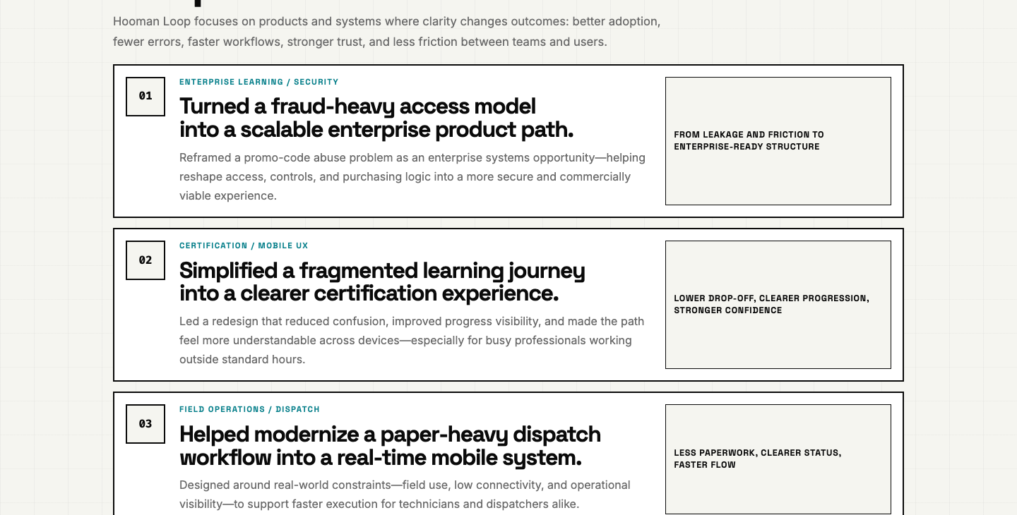
- 4Three text-only proof rows with no product visuals make strong outcomes feel abstract to a skimming buyer.
 5
5
- 5On an ~8,000px-tall page this header isn't sticky on mobile — conversion intent formed mid-page has no reachable action.
We took our own advice: several of these are already fixed on the live site. A critique is only worth running if you act on it.
Before & after
...then we fixed them
Findings are only worth anything if they change something. Here are two of ours, closed.
Consistency · one label for one action
Before
Header said "Book a Thinking Session"; the hero said "Book a fit call."
After
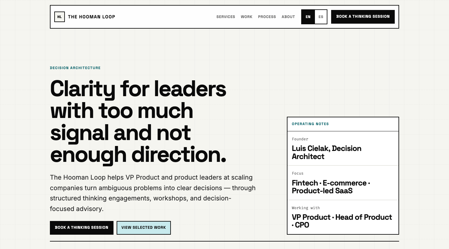
One label, one destination — everywhere.
Accessibility · a real footer landmark
Before

Landmarks stopped at main — screen-reader users had no footer to jump to.
After

A proper <footer> with contact and language links.
And the one we argued with. The critique flagged that our buttons are links, not <button> elements. We declined: every one navigates to an external booking page, and <a> is the correct element for navigation — switching would break middle-click and open-in-new-tab. A critique you follow blindly is a checklist; a critique you can argue with is doing its job.
How it works
Three steps
-
Send one page
Give us the URL of the page that matters most — your homepage, a landing page, a signup flow. One page, so the read stays deep instead of shallow.
-
We capture and critique it
We capture your page on desktop and mobile, then run the seven-principle critique against what a real visitor actually sees.
-
You get a shareable report
A private link to the full report — scorecard, prioritized findings, and screenshots — that you can forward to your team. Typical turnaround is a few business days.
Is this for you?
Who it's for — and who it isn't
A good fit
- You have a live page that's supposed to convert — and you suspect it's leaking.
- You're a founder, operator, or designer who can act on the findings.
- You want a specific, prioritized read, not reassurance.
- You can point to one page that matters most right now.
Not a fit
- You want a full redesign or visual concepts — that's a different engagement.
- The page is behind a login we can't reach, or isn't built yet.
- You're looking for SEO, copywriting, or performance tuning specifically.
- You want a rubber stamp rather than an honest critique.
Need more than one page?
Loop Crit — the same read, for a whole flow
The free crit is one page. Loop Crit covers up to five screens as a single path, ranks fixes by effort and impact, annotates the screenshots, and writes the copy and code changes. $49, back in 48 hours. No credits toward a working session — the report is the product.
Request your critique
Get a free UX critique of one page
Tell us the page and what you're worried about. If it's a fit, we'll capture it, critique it, and send you the report. No cost, no obligation.
We read every request personally and reply either way. Your page and answer stay between us.
Need more than one page? Loop Crit — $49 · or book a Thinking Session · see services.