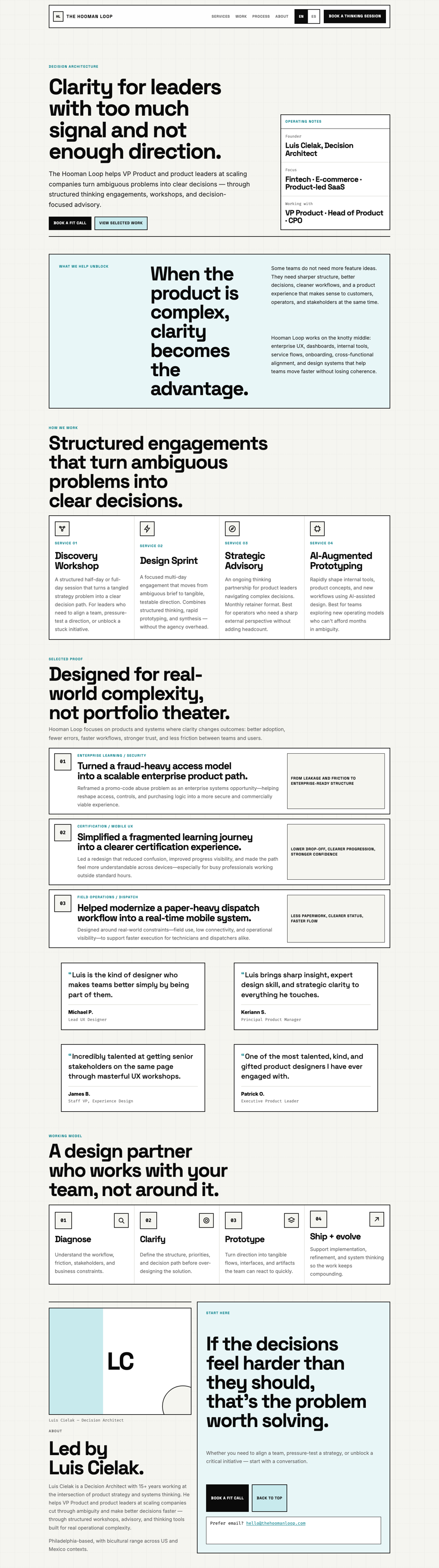

Sample report. This is our own homepage, critiqued with the same process you'd get — nothing edited out. Request one for your page →

UX Critique Report

The Hooman Loop — Home

thehoomanloop.com/

Prepared Jul 14, 2026 · Desktop + mobile · Prepared by The Hooman Loop

Usability4/5
Visual Hierarchy4/5
Consistency3/5
Accessibility2/5
Feedback & Affordances3/5
Cognitive Load4/5
Mobile Responsiveness3/5

The Hooman Loop homepage delivers sharp positioning for product leaders: strong typographic hierarchy, an ICP-qualifying Operating Notes module, and outcome-led proof that matches the clarity brand. Conversion is clear but inconsistent (header vs hero CTA labels and Calendly URLs), and trust still dips where About shows an LC monogram instead of a portrait. Accessibility gaps—accent labels under AA contrast, no footer landmark, and a non-sticky mobile header on a very long page—are the highest-leverage fixes.

Desktop capture of thehoomanloop.com homepage

Desktop

Mobile capture of thehoomanloop.com homepage

Mobile

Usability

Testimonials attribution

low

User impact
Quotes use first name + last initial and title only—no company. For enterprise buyers, that weakens social proof relative to the operational outcomes claimed above.

Recommendation
Where permitted, add company or product context (e.g. “Principal PM, fintech platform”). If NDAs block names, say “Enterprise SaaS · Principal PM.”

Technical note
Extend figcaption with a third line; keep role in muted mono. Do not invent logos without permission.

Visual Hierarchy

Selected work / proof rows (text-only, non-interactive)

medium

User impact
Outcome copy is strong, but three text-only rows with no product visuals or “read more” affordance make proof feel abstract—busy VP Product visitors get less evidence of craft than the positioning claims.

Recommendation
Add one constrained visual per case (UI fragment, before/after flow, or redacted dashboard) and/or a quiet “See how” link to a case detail or PDF under NDA.

Technical note
Capture metadata reports images: 0. If NDAs block screenshots, use anonymized diagrams with aria-hidden decorative treatment; keep H3 + summary as the accessible name. Prefer real <a> for deep links.

Consistency

Primary booking CTAs (header vs hero/contact)

medium

User impact
Header says “Book a Thinking Session” (Calendly /30min) while hero and contact say “Book a fit call” (different Calendly URL with UTMs). Visitors may wonder if these are different products or durations.

Recommendation
Pick one primary label and one booking destination sitewide. If the header needs a shorter label, keep the same href and event length.

Technical note
Unify hrefs to one Calendly event; retain UTM params on all CTAs. Treat wording as a shared string/constant so EN/ES stay in sync.

Resolved since this capture. Labels are now unified to “Book a Thinking Session” in both the header and the hero, pointing to one booking destination.

Accessibility

Accent micro-labels (.micro-label / .module-label) on cream and tinted sections

high

User impact
Section eyebrows and service/proof labels in #067F8A sit at ~4.3:1 on #F5F5F0 and #E8F6F7—below WCAG AA 4.5:1 for normal text—so wayfinding labels are harder to read for low-vision users.

Recommendation
Darken accent text for labels (or use ink for small uppercase labels). Keep soft teal for large fills and secondary button backgrounds only.

Technical note
Measured --accent #067F8A vs --bg #F5F5F0 ≈ 4.35:1; vs --accent-light #E8F6F7 ≈ 4.30:1. Introduce --text-accent that meets ≥4.5:1 on both surfaces; keep --accent for focus rings and large UI.

Resolved since this capture. A dedicated --accent-text token (#056068, ≈6.7:1 on cream) now colors small labels; --accent is retained for fills, borders, and focus rings.

Page landmarks (no footer)

medium

User impact
Landmarks include header, nav, main, and aside, but no footer. Screen-reader users cannot jump to contact/email/closing conversion as a dedicated region.

Recommendation
Wrap closing contact, email, and any legal/social links in a <footer>. Keep Operating Notes as <aside> if it remains complementary.

Technical note
One <footer> per page. Confirm landmark tree in the Accessibility panel; avoid duplicate complementary labels between hero aside and contact aside.

Resolved since this capture. A <footer> landmark now closes the page with brand, language, and contact links.

CTAs as styled links (0 <button> elements)

low

User impact
Capture metadata shows 0 buttons. Link-styled CTAs work for navigation and external booking, but assistive tech and heuristics treat “Book…” as navigation rather than a primary action—especially when opening Calendly in a new tab.

Recommendation
Keep <a> for real destinations (Calendly, mailto, anchors). Announce new-tab opens (visually or via sr-only text). Reserve <button> only if a booking modal/widget is in-page.

Technical note
All primary CTAs currently use <a class="button"> with target=_blank. Add accessible name hint e.g. “Book a fit call (opens Calendly in a new tab)” or aria-describedby. Verify :focus-visible remains visible.

Reviewer's note — declined. Every one of these CTAs navigates to an external booking page, so <a> is the correct element; <button> is for in-page actions. Converting them would break middle-click and open-in-new-tab. We're leaving them as links on purpose. A critique you can argue with is doing its job.

Feedback & Affordances

About portrait (LC monogram placeholder)

high

User impact
On a founder-led advisory site, a monogram where a portrait should be undercuts credibility at the exact moment visitors decide whether to book a fit call with Luis.

Recommendation
Replace the LC block with a real portrait (or a deliberate illustrated portrait), keep the short bio, and pair it with one concrete proof signal (years, domains, or a named outcome).

Technical note
Portrait frame already supports img overlay (.portrait-frame img). Add a properly sized <img> with descriptive alt; keep width/height or aspect-ratio to avoid CLS. Prefer AVIF/WebP.

Service cards (static information blocks)

low

User impact
Four services explain the offer well but give no next step per engagement—users interested only in Advisory or Prototyping still hit a generic Book CTA.

Recommendation
Add a quiet per-card action (e.g. “Ask about this engagement”) that deep-links to booking with a prefilled topic, or an accordion with fit criteria.

Technical note
Pass query params (?engagement=advisory) into the scheduler URL; keep the action on an explicit text link so the whole card isn’t a nested hit target.

Cognitive Load

Hero Operating Notes vs H1 (first viewport competition)

low

User impact
The matrix is useful for ICP qualification, but on desktop it shares first-viewport attention with the H1 and dual CTAs, slightly diluting the hero’s single job.

Recommendation
Keep the module, but demote visual weight (smaller type, quieter borders) or collapse denser rows below the fold on mid-width desktops so H1 + Book own the first read.

Technical note
Hero is a 2-col grid with aside minmax(280px, 360px). Test 1024–1280px; consider a definition list with tighter line-height or move “Working with” below the fold via order.

Mobile Responsiveness

Mobile topbar (position: static below 720px)

medium

User impact
On mobile the header is not sticky while the page is ~8,000px tall. After reading services, proof, and testimonials, users must scroll far to book again—conversion intent formed mid-page has no persistent action.

Recommendation
Keep a compact sticky bar on small screens (logo + Book CTA), or add a bottom sticky Book bar that hides when the contact panel intersects the viewport.

Technical note
At ≤720px CSS sets .topbar { position: static }. Prefer sticky top with safe-area insets, or fixed bottom CTA via IntersectionObserver against #contact. Touch targets ≥44×44px.

Resolved since this capture. The mobile header is sticky again, so a Book CTA stays reachable through the full-length page.

Mobile primary navigation

medium

User impact
Nav links remain an inline horizontal scroller under the logo/CTA stack. On a narrow viewport this competes with the Book button and makes section jumping easy to miss on a long single page.

Recommendation
Collapse Services / Work / Process / About into a disclosure menu on small breakpoints; keep wordmark + one primary Book CTA always visible.

Technical note
Use a <button aria-expanded aria-controls> for the menu; keep in-page anchors. Avoid nested interactive regions. Test keyboard Esc/close and focus return.

How this report is put together

Each interface is evaluated against seven established User Experience (UX) principles: Usability, Visual Hierarchy, Consistency, Accessibility, Feedback & Affordances, Cognitive Load, and Mobile Responsiveness. Desktop and mobile captures are reviewed separately where layout or interaction differs.

Every principle receives an independent score from 1 to 5. Scores are qualitative judgments, not an automated calculation: each reflects how well the interface meets that principle, weighted by user impact and how frequently the issue occurs. Individual findings are labelled by severity, and the count and severity of findings under a principle inform its score.

Score scale (1–5)

ScoreMeaning
1Critical failures; unusable or inaccessible
2Significant issues; workarounds required
3Adequate; meets basics but clear room to improve
4Strong; minor gaps only
5Exemplary; reference-quality for this principle

Severity levels

SeverityWhen it applies
HighBlocks tasks, causes errors, excludes users, or damages trust
MediumAdds friction, confusion, or inconsistency for many users
LowPolish, minor inconsistency, or edge-case improvement

How we reached each score

Usability

4/5

Strong; minor gaps only

Based on 1 finding (1 low severity): Testimonials attribution.

Visual Hierarchy

4/5

Strong; minor gaps only

Based on 1 finding (1 medium severity): Selected work / proof rows (text-only, non-interactive).

Consistency

3/5

Adequate; meets basics but clear room to improve

Based on 1 finding (1 medium severity): Primary booking CTAs (header vs hero/contact).

Accessibility

2/5

Significant issues; workarounds required

Based on 3 findings (1 high, 1 medium, 1 low severity): Accent micro-labels (.micro-label / .module-label) on cream and tinted sections; Page landmarks (no footer); CTAs as styled links (0 <button> elements).

Feedback & Affordances

3/5

Adequate; meets basics but clear room to improve

Based on 2 findings (1 high, 1 low severity): About portrait (LC monogram placeholder); Service cards (static information blocks).

Cognitive Load

4/5

Strong; minor gaps only

Based on 1 finding (1 low severity): Hero Operating Notes vs H1 (first viewport competition).

Mobile Responsiveness

3/5

Adequate; meets basics but clear room to improve

Based on 2 findings (2 medium severity): Mobile topbar (position: static below 720px); Mobile primary navigation.

Acronyms used in this report

  • AA — Level AA (WCAG conformance level)
  • AVIF — AV1 Image File Format
  • CLS — Cumulative Layout Shift
  • CPO — Chief Product Officer
  • CTA — Call To Action
  • ICP — Ideal Customer Profile
  • NDA — Non-Disclosure Agreement
  • PDF — Portable Document Format
  • UI — User Interface
  • UTM — Urchin Tracking Module
  • UX — User Experience
  • VP — Vice President
  • WCAG — Web Content Accessibility Guidelines
  • WebP — Web Picture format

Want this for your page?

Send one URL and we'll run the same seven-principle critique — scorecard, prioritized findings, and screenshots — and send you a link like this one. Free.

Request your free critique